Published by We Promote You | Sydney’s branded uniform and promotional products specialists since 2003
Why Getting Brand Colours Right on Embroidered Garments Is Harder Than It Looks
Brand colour accuracy on embroidered workwear and corporate apparel is one of the most technically demanding aspects of branded uniform production — and one of the aspects that most distinguishes experienced, quality-focused decoration specialists from less capable operations. Thread colours do not behave like digital colours, print inks, or paint. They have their own physical characteristics — sheen, texture, dimensional quality — that affect how they read visually, and they interact with the fabric they are applied to in ways that can produce significant colour shifts between the approved artwork and the finished garment.
At We Promote You, colour accuracy in embroidery is a subject we take seriously — because our clients’ brands depend on it. In this article, we explain the practical challenges of colour accuracy in embroidery, the tools and processes we use to manage it, and what you can do to help ensure that your embroidered garments reflect your brand colours as accurately as possible.
The Pantone Reference System: The Foundation of Colour Accuracy
The starting point for achieving colour accuracy in any decoration process is a precise colour reference — and the industry standard for this is the Pantone Matching System (PMS). A Pantone reference number identifies a specific colour precisely, independent of the medium or substrate it is being reproduced on. When a brand’s guidelines specify Pantone colours for their logo and corporate identity, we have the clearest possible target for colour matching across all decoration methods.
If your brand guidelines do not currently specify Pantone colours — if they only reference RGB or CMYK values, or if they reference ‘approximately navy’ or ‘our shade of blue’ — the first step in improving colour accuracy across all your branded merchandise is to establish Pantone references for your key brand colours. We can assist with this process, comparing your existing branded materials to Pantone swatches to establish the closest match.
Thread Selection: The Technical Challenge
Embroidery thread is available in thousands of colours, but the colour range is finite — and does not include a precise equivalent for every possible Pantone colour. Thread manufacturers (Madeira, Isacord, and others) publish their own colour systems that we cross-reference against Pantone references to find the closest available thread match.
The challenge is that thread colour and Pantone colour are different physical media with different optical properties. A metallic Pantone colour has no precise thread equivalent. A very light, pastel Pantone shade may not have a thread match within an acceptable tolerance. And even when a thread colour is a good theoretical match to a Pantone reference, the way that thread reads on a specific fabric in a specific light environment may differ from expectations.
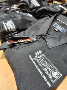
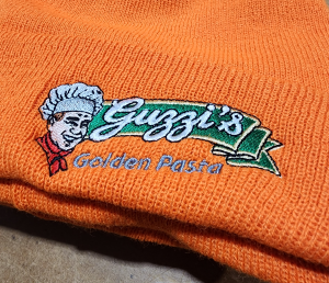
This is why pre-production sampling matters for colour-critical applications. Seeing the actual thread on the actual fabric, in physical form, is the only reliable way to confirm that the colour outcome is acceptable before committing to bulk production.
Fabric Colour Interaction
The colour of the garment fabric itself interacts with embroidered thread colours in ways that can shift the visual appearance of the decoration. Dark thread on a light garment and the same thread on a dark garment can read differently. Very dark garments can cause light thread colours to read as slightly darker. Textured or structured fabrics can affect how thread colours appear compared to the same thread on a smoother surface.
Experienced embroidery specialists account for fabric-thread interaction in the thread selection process — considering not just the thread colour in isolation, but how it will read on the specific garment being used. This is one area where the expertise of the decorator matters significantly.
Digitisation Quality and Colour Fill
The quality of the embroidery digitisation — the process of converting a logo design into the stitch file that controls the embroidery machine — affects colour accuracy in ways that go beyond thread selection. The density and direction of stitching affects how thread colours blend and overlap at borders between colour areas; the underlay stitching affects how colours sit on the fabric; and the stitch type and angle affects the sheen and texture of the finished embroidery, which in turn affects how colours appear to the eye.
We Promote You’s digitisation team has extensive experience optimising stitch files for colour accuracy and visual quality — ensuring that the finished embroidery not only uses the right thread colours but presents them in the way that best represents the brand.
Practical Steps for Better Colour Outcomes
For businesses that want to maximise colour accuracy on their embroidered garments, the practical steps are: ensure your brand guidelines specify Pantone colours for all logo elements; provide your Pantone references to We Promote You at the briefing stage; request a pre-production sample for colour-critical applications before committing to bulk production; and compare finished garments to your physical Pantone reference under natural light rather than relying on screen-based comparison.
Visit Our Sydney Showrooms to see our embroidery quality in person. Castle Hill: Unit 25, 5 Gladstone Road, Castle Hill NSW 2154. Blacktown: Unit 1A, 202 Sunnyholt Road, Blacktown NSW 2148.
Contact us online or call 1300 885 737.
We Promote You — Branded Uniforms, Custom Embroidery & Promotional Products | Sydney | Since 2003